
Great Job 80BEE 2.0 making composing and editing your Rebound posters!
The end result is some awesome and magnificent posters.
Let's take a moment to appreciate and evaluate your work and your peers work.
Explore the pictures and answer the following questions and provide feedback on two of the pictures.
Which ones are the most powerful and vivid? Why do they resonate with you?
Which one provides the greatest recall for you. Meaning as you see the picture the story of Rebound rushes to your memory.
Things to consider when critiquing the photo composition, use of blur, use of lettering, relevance of photo, realism how well it tells the story of rebound
Keep the conversations smart and intelligent and avoid the temptation to be petty and insulting.
After we will conduct a poll and vote for the best picture of them all and also pick the group that has the best collection of 3 photos.
Keep the conversations smart and intelligent and avoid the temptation to be petty and insulting.
After we will conduct a poll and vote for the best picture of them all and also pick the group that has the best collection of 3 photos.
1A

1B

1C

2A

2B

2C

3A

3B

3C

4A

4B

4C

5A
5B

5C

This comment has been removed by the author.
ReplyDeleteThe most powerful and enticing photo is 4A because of its subtlety and originality. The photo doesn't give away too much excess detail yet it still communicates the message of Sean and David playing together. The text is morphed profoundly and matches directly to the hues of the basketball. I like how the massive silhouettes are blurred while the text is in focus to draw major attention to the quotation. It's interesting how the photo clearly shows that David is in the wheelchair and is holding the orange and white basketball with the text. I think, David holding the basketball leads people to speculate the photo to be in his perspective.
ReplyDelete4A is a fantastic photo ... the creativity and precision is outstanding and makes the photo resonate with the viewer! good analysis
DeleteThanks for the compliments,anything you would change,add or takeaway from the photo to be perfect?
DeleteAny major change to it means re doing the entire photo. Maybe a few tweaks to the editing and positioning could work but the rest is perfect.
DeleteThe photo with the strongest recall is 5C because of its representation of the main topics of "Rebound". By first glance of the photograph, the main characters and goals are portrayed. Sean and David are working to reach their goals of basketball success is clear. This photo could be deemed as "plain",although when justifying the point of reminiscence this photo tells the whole story. Everything is placed seemingly in an obvious format to the point where text isn't necessary to understand the scene. I think, this photo recaps the main points of "Rebound" very well although a little subtlety could've done well.
ReplyDelete5C is a traditional and predictable composition but in black and white texture it takes on a new life
DeleteTest
ReplyDeleteThis comment has been removed by the author.
ReplyDeleteTest
ReplyDeleteTest
ReplyDeleteThis comment has been removed by the author.
ReplyDeleteThe picture with the most profound and resonating message is 1B the composition of the text is well merged with the backdrop along with the factual elements such as fear can be easily seen. The ambience showcased Sean shrouded in darkness while the shadow of Mr.Mcculley was towering over a exceptionally good use of angles. The main figment of Sean was also not the center of attention located further down. Overall a great presentation and composition with regards to subtlety of editing
ReplyDelete1B is a wonderful use of shadow and lighting work to try and build suspense and drama!
DeleteThank you for the comment.The lighting and finding a particular area that was closed of to hold the darkness was difficult but it worked out .
DeleteThe photo that is the most powerful to me is 1A. The angle of the photo is taken so that you can clearly see the hand on the shoulder as if the person is giving them advice of some sort. The lighting isn’t too much and it doesn’t look over edited. The quote works well because the hand on shoulder signifies the person is talking to someone and the quotes makes it seem like they cast pity on the person and that’s why they are being generous.
ReplyDeleteThe photo that provides the greatest recall in the book is photo 1B. My reasoning for this is because the shadow cast upon the wall makes it look like they are full of rage and disgust and you can see someone with their head down as if they are worried or frightened. This automatically makes me think of when Sean was called to principals office and almost got expelled on the first day of school.
1A is definitely a photo of simplicity but drives the message home of David being babied and pampered
DeleteThe photo that I found most powerful and the most recall is 5A.
DeleteI found this picture most powerful,is because it includes a natural bluer in the background.
I also really like this photo because both the words, and the picture were kept simple, and didn't look to edited.
The words didn't overpower the picture to much, nor did the picture overpower the words to much, so that the person looking at 5A's picture, wouldn't have to choose whether to focus on the picture, or words, because they could easily just focus on both, and they go together so well
Also, the main focus in the book is the David, and so this photo made David stand out, and made David look like the main focus, as he should.
This photo showed how powerful David really is, and that he isn't weak just because he's in a wheelchair.
Thank you nefi we tried our best to use the natural lighting from the window and use a contrast affect working light to dark it took time but was worth it
DeleteThe photo that I find resonates with me and is full of power is 4A I find this photo powerful and original.The communicates a scene in the which we all remember but doesn't give away like a retell.The photo takes the picture of Sean and daviad playing basketball but changes the way.Instead of portraying the same basketball blocking scene.They add the shadow giving it originality and the basketball show what the book mainly about.
ReplyDeleteThey focused the shadow but blur a bit of the background giving it a cool aspect.Also a great touch that allows the photo to stick is the text the fading and curved between the basketball show it working in to the text instead of being placed on. The creativity of the photo and message it shows without giving it away allows the photo to resonate and be powerful
Indeed a very powerful photo
DeleteThank you for the comment our group took numerous retakes to get a suitable and desired effect and powerfull message
DeleteThanks,good to know anything you would change or add to the photo.This shot was my favorite to.
DeleteTest
ReplyDeleteThe photo 5B looked like it has a bit too much contrast and it looks slightly over edited and a complete re-tell. The text looks a bit rushed and no variation between different fonts and colours to make the font catch the eye of the viewer.
ReplyDeletewhat suggestions could you make to improve this photo and composition
DeleteI suggest that they tone down the contrast a bit because it looks a little too bright and for the quote they use different fonts and colours to make the photo compliment the text
DeleteWhich ones are the most powerful and vivid? Why does it resonate with you?
ReplyDeleteI think '1B' has a very interesting concept and feel to it to make you feel a bit intimidated by the shadow also known as Mr.McCulley. This picture has a sort of feel that makes the viewer see it as the person cowering at the bottom is scared of the shadow.it has a great resonation that makes you think about it differently on how else it can deceived with a different meaning or a different thought about it.
Which one provids the greatest recall for you.meaning as you see the picture the memory of rebound comes flushing in.
I think 4C has a great perspective on the story and the scene where Sean is supposed to sit out in the hallway while Mr.McCulley contemplates how he is gonna figure out the punishment for Sean. While Mr.mcCulley Is in his office, Sean is left out in the hall on a bench with though of 'him on display' which sends the same thought through our minds that ' he could be counted as on display for students to look at '
Thank you for understanding and appreciating the drama and shadows of 1B. It took a really long time but it was worth it!
DeleteHats of to you Megan! 4c was really last-ditch stuff from our group. We had a strong two first photos to present, but our third was split in to 2 photos that just got done on the deadline. We inevitably Had a choice to make between the latter and a similar retell shot where Sean was waiting on the bench in front of the front office, that me and rakulan edited in black and white tones. I'm starting to feel like we made the right choice!
DeleteThis comment has been removed by the author.
Delete5C had a very vivid retell aspect but the retell was only present because of the lack subtlety. The characters and objects were placed unumbellished the idea objectifies the main points. The photo seemed very general and reproduced a comprehensive picture
ReplyDeleteIn my opinion, the most vivid picture taken from the rebound photo assignment had to be 4A. The pictures focal point is something very obvious, but still ominous enough to not give away the whole story in one shot. The usage of natural blur realy makes the focal point stand out more than a contrast or saturation bump. The Shadow play realy captured the core elements of the story whitout giving any of it away. So adendum, the phot was well balanced, very well taken, edited, and captioned. A worthy book cover in my eyes
ReplyDeleteTest
ReplyDeleteI think 1B and 4B are both greatly edited,the natural blur and the concept story behind each of the pictures are amazing, it's greatly captured and edited really good.A tip for 4B would be to have the camera focus a little more on the bloody hand and have the legs walking to it a bit more Blury as if he was blurring out. A tip for 1B would be to capture a bit more of the student to make a bit more chilling? I guess would be an appropriate word, overall both of those pictures are well detailed and have a good prospective to take the shot..try not to blur it too much. Great pictures!
ReplyDeleteThanks a great tip looking back at our picture that was something that could of been implemented
Deletegreat depth in your critique and suggestions Megan
DeleteThank you it was challenging to get the shadow to show clearly.It was hard to work the lighting but it worked out!
DeleteThe picture with that really puts you in the book is 4B, with its over dramatic presentation it really get me nostalgic about the book.
ReplyDeleteThe almost dead hand really put this scene into focus with the bright red hand the purple scabs to resemble the cuts where the points them out in the book, and the shoes in the background to really take the audience back to the story.
therefore I believe that this is overall the best photo, but i'm not excusing the great work of others.
4B is very clever in the subtle details like the VP McCulleys shoes in the back ground ... it gives a traditional and predictable composition a fresh vibe
DeleteThe shoes and the quote about getting to his feet was a beauty.The shoes we borrowed took the picture to another world.Glad to see you liked it
DeleteTest
ReplyDeleteFor me 1B felt the most strong and vivid. As you take you first look at the photo it showes one of the most iconic scenes. It quickly takes you back to the beginning of the story with the quote to help along side. The dark vibe to this communiacates fear and darkness, Sean feels scared as Mr.Mcully is standing over him with his big shadow. The text also fits in good with the lighting in the background. There was some parts needed to be fixed like the lighting, it could have worked on a bit more as it is not stable in places. All round it was good photo that really brought me to remember the story and great editing to go along with it.
ReplyDeleteabsolutely there is a very dark and gloomy feel to this photo
DeleteTest
ReplyDelete3B had a good picture but the simplicity and body launguage couldn't really sell it. The picture had many vague aspects and being a scene of explicit anger the contrast should have been prominent. If the text was removed could the groups perception be understood and would the scene keep true to displaying its approximantion
ReplyDeleteThank you for the criticism and telling us how we can improve.
DeleteThe picture that resonates the most with me is 4a.I beileve this picture is very subtle with the details it provides but if you catch it,it will all start to make sense.For example we can see 2 kids by the hoop 1 in a wheelchair and the other towering over him leading us to believe that it's Sean and David we also see Sean facing his back towards the net and his hand reaching out about to go for the hookshot.Although it was my group that worked on it,there are still improvements that can be made.One being the quote was quite simplistic and overused I have seen grades in the past use the same quote many times over and is the go to line for a basketball scene,however I do believe the text was very well edited not only the way it was integrated on the ball and around was very neat.
ReplyDeleteThe quote and the detail of the text work is just as powerful as the photo itself!
Delete1)I think the most powerful and vivid picture is the scene hey are you coming because it shows that he has nice shoes and it seems like David is a good kid and stays out of trouble but really he’s not.It resonates with me because I learned that you can’t tell how a kid behaves by just looking at him or her.2)the second one is get to your feet now because that shows when he is on the floor and there is blood around him and that shows that there has been a fight or something happened.I did say you can tell what happened or what kind of kid it is by just looking at a picture but this picture tells because it’s showing you his hand with blood all over it.this resonates to me because now you get a little bit of what goes on and your not clueless of what’s going on.
ReplyDeletewhat photos? use the Lable 1A or 3B etc
DeleteThe photo that I found most powerful and the most recall is 5A.
ReplyDeleteI found this picture most powerful,is because it includes a natural bluer in the background.
I also really like this photo because both the words, and the picture were kept simple, and didn't look to edited.
The words didn't overpower the picture to much, nor did the picture overpower the words to much, so that the person looking at 5A's picture, wouldn't have to choose whether to focus on the picture, or words, because they could easily just focus on both, and they go together so well
Also, the main focus in the book is the David, and so this photo made David stand out, and made David look like the main focus, as he should.
This photo showed how powerful David really is, and that he isn't weak just because he's in a wheelchair.
agreed a very composed balance of text and photo...neither one distracting form the other!
DeleteThank you for this comment. We edited 5A lots of time to make this picture as it is .
Delete2A's composition stemmed from a good idea, however the execution was, to say the least "not there yet". The basic edit simply required some focal blur and some lighting touches. But due to the original photos lack of natural blur and lighting, the edit turned out blurry and unclear even to a reader of the source material. Angle experiment seemed to be a after thought, as the composition presents itself as a one shot go, rather than a masterpiece that the ideal concept truly deserved. The text was very well placed and formatted. With small details like the macthing coulors of the cigarette. The photo and editing should have been give more time and feedback, as the text is truly the only stand out feature in the perfect picture concept. Better luck next time guys!
ReplyDeleteI do feel that the photo seemed a bit blurry and something felt off-putting about it. Thanks for your feedback!
DeleteYes I very much agree with your opinion Julian, though the pictures thought process came from a couple of others before resorting to this version, yes I indeed agree that we should have taken more pictures to get a better natural blur having it focus a bit more on the foot and the cigar leaving the background Blury. The text should have been blended a bit better like it was graffiti because young whippersnappers and their spray paint ( lol don't even ask) but yes I do agree with your opinion, thabks for your feedback! We will try again better
DeleteThe photo that is powerful for me is 4A . The natural blur that is in the the photo makes the picture more better. The text size and colour is a good match for the picture. We can see that David is taking a hook shot and the picture matches with quote that was given in the picture.
ReplyDeleteThe picture that makes me remind rebound quickly is 3B because the quote in the story is powerful. This shows that in the story Sean was holding on to the wheelchair for moving David around in the school. This recalls that David was mad at Sean for touching the wheelchair.
ReplyDeleteI think the photo that provides the largest retell is 3 b when first looking at it I remember the exact scene when David got upset from Sean about to push his wheel chair.They the group set up the scene and angles it really just told me exactly what was happening.Without a chance of making me think and infer deeper of what the scene the photo was portrayed. The picture didn't have much originality with the text and the scene.It was mainly the same exact as the book making it very easy for me to reflect it back to the particular scene.A factor which the group should pay more attention to is the jersey of which daviad should be wearing.But a point which I did like was the color corditnation between the shoes way back in the image of black and white.In the next task I think they should work on more angles and creative text to make it a little bit less of a retell.I
Thanks Nia for your feedback.I totally agree with what you said. Thanks for giving us your opinion on how we can improve and make our pictures better.
DeleteThe most powerful picture is 4B because when I read the text I instantly thought about when Sean and David got into a fight and Mr. McCully. The picture speaks to me because there wasn’t a lot of changes they made to the picture so it looked like it standard out more the lighting looked perfect and the fake blood really helped with the scene when Sean and David were fighting.
ReplyDeleteThanks alot Jahseem! Anything you would add to it? I agree the blood and the shoes drove that picture home.
DeleteThe greatest recall for me is the don’t touch my wheel chair scene because it reminds me that half of the story is about a kid in a wheelchair.
ReplyDeleteThanks Isaiah for the comment!
DeletePhoto 5C I think could of zoomed a little bit more in because there is a huge empty space. So the group could the group could of either made the text a little bit bigger or they could zoomed a little bit onto the two people playing basketball.
ReplyDelete2C was a very original and powerful photo . As you take first look you can see Sean being scared as to enter the school dance as it's his first and on top of that you can also infer that he is scared of seeing Mr.Mcully. The great text work follows the theme of being at a dance as well as being scared. The blur in this photo really makes you think that Sean is zoned out of everything, the contrast of color ads a touch to that too.The Red in the text contrasted very well with the white in the photo. It is a very clean and basic photo that tells a lot but is not retelling. There is a lot that you can think of or be reminded by this photo as the dance is a very significant part in the story. Great photo all around.
ReplyDeleteThank you Talal
DeleteYes thank you!
Delete2A had a great composition and very subtle but effective editing the only suggestion was the contidiction, being the fact that this scene was about Scott smoking but the picture was showcasing him crushing the cigarette. The text slightly faded into the rocks but otherwise the contrast and saturation was quite appealing. Last critique would be to add a subdued image of maybe the school or steps in the background. Of course this is my subjective take , but beautiful picture regardless
ReplyDeleteI agree the text faded into the rocks and now that I look at it, it does contradict the quote
DeleteWhy thank you oh great sir and, your critique gives a good tip on how the school steps should be in the background showing that it was Scotty boy smoking infront of the school or school steps ( same thing pretty much) thank you =^>
DeleteI agree with your comment
DeleteThe picture that is most of a retell is 5C.
ReplyDelete5C'S picture ( much like the previous pictures) is a complete retell of the text. Many people in the past have done scenes from Rebound where David, or Sean are shooting hoops, (since they both have a passion for basketball)
I have seen many picture much like this one illustrating Rebound, and so I feel that this one is most of a retell.
The photo in my perspective that is the most powerful and vivid is 4A. The reason why I chose this photo is because of the complete creativity. When I first glimpsed at this photo, it caught my complete attention of the creativeness and how it takes me back to the scene it represents from. I loved the way how the editors made Sean and David into shadow-like figures playing basketball relating to the text “Even I don’t get them all in”. With a natural and creative faded font which also caught my attention. This photo resonated with me a lot from the complete blur,font,text, and texture. This photo made a good impact being the most vivid and strong. It also has many aspects and originality in it, making it the most powerful and vivid out of all the other cool photos overall.
ReplyDeleteThank for highlighting those aspects it was a quite time consuming picture glad to it was quite appealing
DeleteI liked 1A’s photo because the photo was amazing as soon as I looked at the photo, I remembered the scent were the teacher started talking slowly to David because she thought he had a different mind set from everyone else. One thing you can change about the picture is not to make the background so bright try to brighten it down a bit so you can see the text a bit better as well.
ReplyDeleteThe picture that gave me instant flashbacks to the story of rebound was 1b it doesn't show what happened during the fight but after when Mr.McCulley punishes Sean for getting into a fight.This is the best representation of the story because from that major point is what the story spirals off of when Mr.McCulley makes Sean,David's host they start to be friends and it all started from the fight.Something to consider when editing your picture is if what you want to stand out does the shadow on the wall is quite faint but when you catch it,it is formidable all around the photo was a well done photo
ReplyDeleteThis comment has been removed by the author.
ReplyDelete3A also provides a great recall because it presents two major points in Sean's(the protagonists) life. Although this photo could be criticized to be basic,the basketball in it reflects the main topic:basketball. The ball could be justified as random and bizarre to co relate to the scene, but the ball does bring back "Rebound" vibes. One of the most vital scenes in "Rebound" is when Sean begins to understand David as a person and friend rather than a paraplegic. Thus the quotation in text that matches the colours, goes well with the intricate scene. David's drawing easily can be seen as strong and important because it's the first time we get to understand David. I think that although the scene is popular amongst many groups throughout the years, the ball in the photo is unique and instantly represents "Rebound".
ReplyDeleteI agree with what you said Zara! Thank you for the feedback.
Delete3A's direct scene grab from the text strongest element was the retell factor. Throwing a pre edjecated reader to one of the first scenes in the story. My main poins of criticism in these post are usually there obvious scene place ment and compositions. However, the photo main objective is a direct retell of core scene in the book. The editing was simple, or in other words bland. The text was under thought and unconvincing. More detail next time
ReplyDeleteThank you for your comment julien! really apperciate it.
Delete2C is a good photo where the quote stands out . The photo matches with the quote because we can see that David in the hallway. This photo is the perfect match for the quote
ReplyDeleteHow do you think the photo relates to the story Sanjay?
DeleteThank you
DeleteI think that 4B is powerful because It doesn't look as if red paint is applied on Sean's hand.It looks like it's actually bleeding because of the details on the hand and the blood.I also like how the group blurs the hand a bit and in the background,the focus is on Mr.McCulley walking towards Sean and about yell at him.The group did amazing on editing the picture.It really brings out the picture as if it happened outside on a bright sunny day.The choice of the fonts and the colour matchs the picture well.The idea is original and the group still made it so detailed and blooming!
ReplyDeleteWow thanks we tried our best to make the contrast powerfull enough to really darken the scene and evoke natural elements
DeleteThis is great,you noticed alot of aspects we loved as well even the shoes in the background.Any thing you want to add or modify in the picture?
DeleteI love this picture because of the details in the picture.Amazing job on the picture!
DeleteThis comment has been removed by the author.
ReplyDelete3a is very nice but I think the blur is a little to visible to me,So I think you should blur the whole table and basketball.
ReplyDeleteThis comment has been removed by the author.
DeleteO problem
DeleteThis comment has been removed by the author.
ReplyDeleteThe most resonating and powerful message would be 4B. The scene and text is very well merged together it is very emotional and takes you back to the scene where David is beating up Sean. You can feel the struggle of Sean trying to get up just by looking at his fingers. The dramatic effect by using fair amount of contrast also made the picture very resonating. The composition really makes you really feel the picture. The close up angle of the picture also made a good focus on the struggling hand. Which makes the picture really stand out.
ReplyDeleteThanks! We tried our best to make the photo as real and crisp As possible.
DeleteThanks amisha! All of this feedback really makes all the time and effort we put in to is worthwhile. Especially ansh's hand. He couldn't get the ink of for days!
DeleteWe had numerous shots of trying to make it seem like he was trying to stand up but was struggling.Glad to hear you enjoyed it just as much as we did.
DeleteAnything you would like to add to this picture?
Delete
ReplyDeleteThe picture I think is most powerful is 3A because in the quote it says nothing about the drawing/how David was drawing the teacher, so the picture itself is amazing but it makes you infer that David is basically a normal student and can do almost anything that an average student can, which makes Sean forget that David is in a wheel chair. So I think that the quote plays a major part in this picture and inferring it will tell you everything that is happening in that scene.
thanks! We tried our Best to make the viewer see that
DeleteOne great picture is : 1B is a great picture because we can clearly see that the person is looking down . The shadows helped the picture by looking more darker and make it look sad for Sean . This picture shows that Sean is sad because he might get suspended on the first day of school. Very nice puctyrw 1B
ReplyDeletesorry very nice picture!
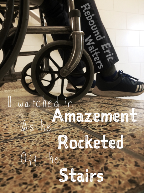
ReplyDeleteI like 3c because the picture reminded me of the time when David jumped off the stairs when Sean and David were trying to get to their classroom before they were late I liked that picture it was good overall the Eric Walter text you could have tried to make look like it was apart of the wall
ReplyDeleteThe ones I liked the most was 3C, 4B, and 1A
ReplyDeleteI think that 1B resonates with me because the viewer should be able to relate to be in the situation, of standing out negatively or feeling like all eyes are on you. The shadow really shows that at 13 this should really connect with most of us, on how some of us are really seen the photo tells its own story own and also really take you back to the book.
ReplyDeleteThe composition of 2C is very nice. This picture flows together well. It doesn't give away anything in the book. The image itself it great. The dim light actually compliments the picture to look put-together.I havent seen any group do a picture like this one.You can tell they thought about it. The text makes everything cohesive. I like how the pop of red in the text goes with the exit sign on top of the door. It gives it a nice splash of colour without making it to obvious. Overall the picture is creative and different.
ReplyDeleteThank you Savitha! Is the anything that we can change it?
DeleteWhen I look at the picture 1A all the memory of rebound rushed to my mind when I saw this picture. In the first few chapter we heard that the teacher thought that David had a some brain damage so they would talk slow so he could understand, so when I see this picture then read the quote I remember most of the first few chapters. Also because of the fonts "anything" is in bold which makes me read it how the teachers said it.
ReplyDeleteThis comment has been removed by the author.
ReplyDeleteThis comment has been removed by the author.
ReplyDelete1b gave me instant flashback because it's one of the main points in the story.It shows how furious Mr.McCulley is and how Sean is looks guilty in the picture.Also,the quote stands out in the picture and goes with the scene
ReplyDeleteI think the most powerful picture is 1B. I like how the shadow stands out and the black and white concept, the picture really pops out and the text or the quote is like a compliment for the picture in a way that looks amazing. This picture also explains a lot of detail too, it explains how Sean got Ito a fight and Mr. MCcully came into the fight to stop the both of them. After when the fight ended, Mr.MCcully sent Sean to his office. "Get to my office NOW".
ReplyDeleteThe picture that floods my memory back to the scene within seconds would be 1A as it triggers my memory back to when the teacher was talking in a different tone with David and treating him differently as he is in a wheelchair. This scene really stuck out to me because the teacher was treating David in a way that he shouldn’t have been treated. We all should be treated equally and we shouldn’t just assume things by looking at someone even if they are disabled.
ReplyDeleteSorry! into.
ReplyDeleteThis comment has been removed by the author.
ReplyDeleteI think 2a and 3a are the best and why?I clearly see some mistakes and added saturation,blur and other things visible things,I personally think that 2a and 3a are the best because both pictures have a perfect editing,So when I looked at the two picture's,I think the most powerful are 2a and 3a
ReplyDeleteI think the most powerful photo was 1c. The shadow on the wall captures the eye and creates a great image. The text also blends in well with the background colors, and the way it’s placed also fits in well. The picture is simple, but the text going along with it creates a more strong portrayal. The way McCulley’s shadow is larger than Sean brings out how he has more power and his voice would be terrifying. As for feedback, I would suggest that the “Eric Walters” line is sort of interfering with the shadow, and could be placed somewhere else.
ReplyDelete4A really reminds me of the scene it came from. Where Sean was showing sympathy for David when he didn’t get his shot in, but David ended up shocking Sean with his skills. Like 1c, the shadow is what brings out the picture. I also like how the colors for the text are the colors of the basketball, it compliments the picture. The way the author and title is placed on the basketball with the bended text is placed really good. And the picture overall reminds me of the scene right away.